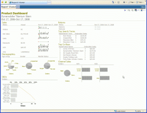
 There’s so much you can do with the data in the ATG Data Warehouse. One of the things I recently tried exploring was building a better dashboard. ATG Customer Intelligence ships with a number of interesting dashboards but I was recently inspired by the work of Stephen Few and others on building better a better dashboard. So challenged myself to see if I could build something similar using Report Studio.
It turns out that you can and it really isn’t that difficult. The following Product Dashboard was developed in just a few hours using Report Studio and uses many of the guidelines described by Stephen Few such as placing your most important metrics in the upper left, the use of spark lines for showing trends and making the data (vs non-data) prominent and clear.
The place where I spent the most of my time was in the layout. That may be because I’m really bad when it comes to laying out visual components. I settled on a grid layout using the cells of a table to layout the major components.
I used a few tricks to produce the spark lines charts. I started with a simple line chart. Next I modified the size of the chart to a fixed height and width of 35×80 pixels. I removed the legend and hide the Y1 and ordinal axis. I also removed the grid lines and axis labels. If you do all that you can pretty much simulate a spark line chart using report studio.
I did some of the same things for both the pie and horizontal bar charts. Report studio gives you a lot of fine control over the visual aspects of your charts. You just need to fool around a little with the various properties to get the look you want.
Besides all the whiz-bang stuff described above this dashboard also demonstrates some really interesting things you can do with the data in the ATG data warehouse. For instance under the Channel Sales section I’ve broken out sales metrics by channel. In the Top Search Terms section I’ve included data about top search terms used to purchase the selected product. There’s also a section entitle Returns which shows information about returns and refunds. Lastly the Top Co-Buys section demonstrates how you can discover cross-sell relationships using the data in the warehouse.
If you’ve got an interesting dashboard idea write to me and let me know.


[…] Intelligence contains all the tools you need to build such a dashboard. See the following post for more details about building a better […]
[…] Dashboard: Multi-Channel Sales Dashboard 12 01 2009 I recently posted an entry entitled Build A Better Dashboard in which I described how to build a product dashboard using ATG Customer Intelligence. In this […]